
15th Mar 2022, 5:15 PM

Hey everybody, sorry for the extended break! Thanks for hanging in there! I used the time to do some art fixes on Issues One and Two, both major and minor. Unfortunately I ended up going down a bit of a rabbit hole and went into granular detail tweaking word balloons and even the kerning between letters, so it ended up taking longer than I had planned. Clip Studio Paint is great for the art process of making comics but I think its lettering functions are one of its weaknesses. Nothing I couldn't painstakingly work around, though... (groan)...
The remastering was all in pursuit of the dream I've had for a while, of printing some physical copies of all the material I've done so far. I'll take this opportunity to ask you all - would any of you be interested in buying print copies?
If so, would you rather do it through a crowdfunding campaign (platform to be determined) or a regular print-on-demand webstore type of thing? If you have opinions, PLEASE let me know in the comments! I would love to hear them!
EDIT (4/6/2025): I changed this cover recently, because the story took on a different direction as I created it, and I wanted to create a new cover that reflected the story better. So here it is!
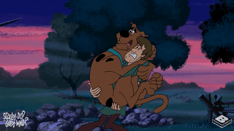
So this cover is an homage to the classic horror comics published by EC Comics in the 1950s. I started to get into EC stuff, via reprint collections, right around the time I started working on Issue One, so there is definitely an influence on how I drew the scenes of Sugar Daddy bringing the Gingerbread Golem to life. This new issue will have a slightly darker undertone to the story, as we will see what Sugar Daddy's ultimate plan entails, as well as Sugar Daddy's origin story! So I thought the horror flavor would work well as the cover to this issue, but since this is also a superhero comedy, I decided to pose Steamroller Man and Night Knight somewhat reminiscent of Abbott and Costello Meet Frankenstein or even Scooby Doo.
I had an absolute blast drawing this cover image. The parts that took the most time were researching the look of these covers, and designing a masthead. I measured the dimensions of each element and then came up with a way to give them a Steamroller Man flavor (like changing the "EC" logo to the "SR" from Steamroller Man's belt buckle). Drawing the actual illustration seemed to go very quickly, but then I got slowed down again when it came time to color it. I even bought a cool set of halftone texture brushes from True Grit Texture Supply, but didn't end up using them, as the effect was more suitable for mimicking interior pages printed on pulpy newsprint rather than a cover printed on glossier paper. I am not a confident color artist, and I think I must have tried every color combination under the sun. I finally settled on this, which I'm still not 100% happy with, but I just emerged from one rabbit hole and was not eager to descend into another!
The final, and possibly most enjoyable step was adding weathering effects! I had to hold myself back from making this look so trashed that the image was obscured! Everything you see, including the staples, the torn right-hand edge exposing the newsprint below, and the coffee stain ring, is all hand painted by me.
I'll post the uncolored, ink-only version, as well a clean color version without the weathering, on my Instagram, Twitter and Facebook accounts, if you're interested in the process. You can find those all linked at my LinkTree.
Now to start drawing the story!